Liam Wynn
This is my site. Here, I make neato projects and blog posts.
How I Did It: Generating a Height Map in Ulysses
Now that Ulysses is live, I think it’d be a neat idea to explain how it does its only feature: generating heightmaps. My goal was to create worlds that were not only interesting, but also scientifically plausible.
Before I get into how I did this current version of Ulysses, I think it would be neat to get into how I originally attempted Ulysses.
Worlds With Just Perlin Noise
Some of my earliest experiments were using nothing other than Perlin Noise. For many purposes, this will likely work just fine. However, I began to notice similar patterns emerge in the kinds of worlds being produced. As an example, here are some worlds I whipped up using the not-Perlin-Noise-algorithm.
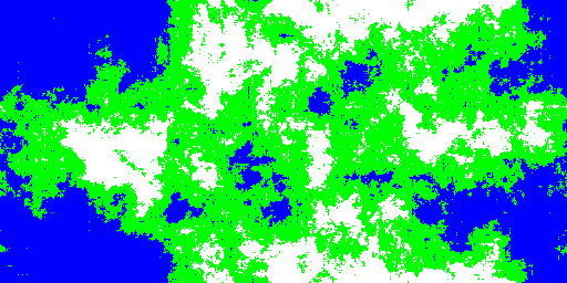
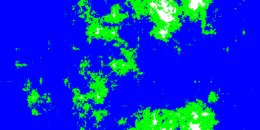
I should breifly mention that of these five examples, these two were the most distinct looking.
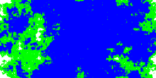
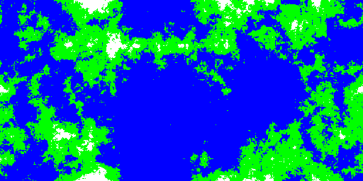
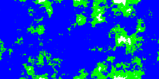
Now, to be fair, simple Perlin noise worlds have a lot going for them. First, their simple to generate, and very efficient. In fact, using Minecraft as an example (which I think early versions used a form of the Diamond-Square Algorithm), you can have worlds that are infinite. Since a fractal world is quick and easy, you don’t even need to keep them in memory.
However, it did not take long for me to start getting worlds that begin to show similarities. While the first two worlds are fairly unique, the latter three show commonalities. Mainly, they begin to have a gaping ocean in the middle of the world. Also, the mountain ranges only appear as you move inland. In my early experiments, I went through upwards of a hundred worlds as I tweaked parameters. I would bet that if you did the same you’d start to think every world was the same too.
Further, I’m not all too convinced these are realistic worlds too, at least if the goal is to mimic Earth.
I tried other algorithms and tweaked all kinds of parameters for a long time before I decided that a fractal or simple noise approach was not going to cut it. I did a little digging and found a neat system that does a full-fledged plate tectonics simulation. In fact, my two favorite ones are found here and here.
A long time ago, I tried doing my own implementation of something like those two. However, I occured to me how woefully outclassed I was. Thus, I decided to try a new approach.
Snapshots of Earth
I got an idea for my generator when I was reading some texts on Geology. I asked myself, “What if, instead of a realtime plate tectonics simulation, we took a snapshot of the world at some time t, and tried to ‘guess’ what the height map would look like?”
To make this idea work, I would need something to the effect of ‘metadata’ about the world. Essentially, I would have to quantify the height of any given point on the world as a function of other pieces of information. In other words, “if I new everything about a point except its actual elevation, could I guess if it’s submurged by an ocean or not?” This seems like a strange idea, but as it turns out, there’s a lot of metrics by which this idea holds weight.
For this idea to work, we need to select the data we’re interested in. Before I do this, however, let’s define a couple of things. First, we say that a given point is “continental crust” if it is not submerged by an ocean. Second, we say that a given point is “oceanic crust” if it is submerged by an ocean.
Throughout Ulysses, I use these terms fairly regularly, even if they are pretty self-explanatory. So it’s a good idea to define them.
Now that we have that tangent out of the way, lets figure out what data we will use to guess if a point is continental or oceanic. Does any such data exist? As far as I could tell, no. Not in the sense that crust is a direct function of. However, there are some really great indicators that work well enough. Let’s explore these.
The Moho Discontinuity
The first, and arguably best indicator of continental crust is what is called The Moho Discontinuity. It is the boundary between the Earth’s crust and the Earth’s mantle. Essentially, it is a measurement of the depth from a given point on the Lithosphere (where all crust resides) to the end of the mantle. On average, from the ocean floor to the Moho is 5 to 10 kilometers, and for continental crust it’s about 20 to 90 km. Looking at a map of it, we see just how well it maps to the height of a point:
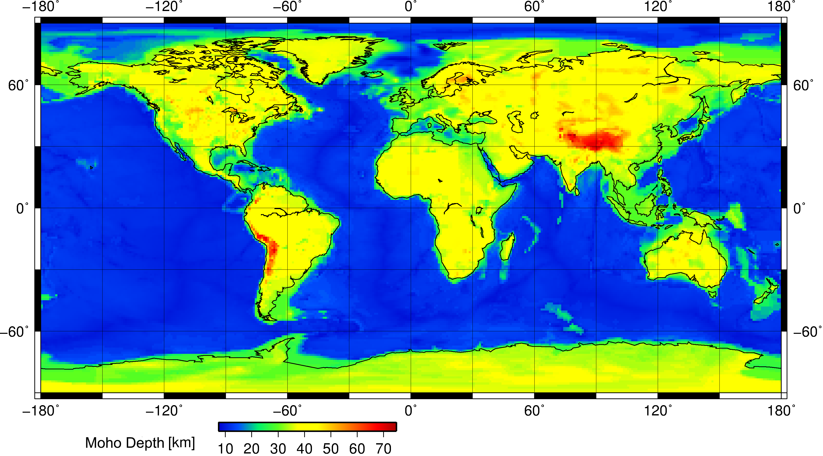
Credit to Wikipedia. For more information, go here
Age of Crust
The next piece of data used is the age of crust. This primarily applies to oceanic crust, as you will see. Before we get into the age of crust, we need to have a bit of background on Plate Tectonics.
If you’re not familiar with the theory of Plate Tectonics, it goes something like this: The entire lithosphere (where all the crust is) is divided into some number of giant sections. We call these sections plates. These plates shift around and collide, causing earthquakes, volcanoes, mountains, and just about everything. For more information, go here
Here is a neat graphic of the plates:
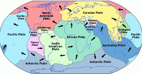
Plates range in sizes, and different things happen depending on their interactions. The interesting stuff happens at the edges of plates. There are three different kinds of collisions, but only two interest me: convergent and divergent boundaries.
In convergent ones, plates collide into each other. If continental crust smashes each other, we get mountains. If oceanic crust hits continental, the continental overlaps the oceanic and we get mountains. If oceanic hits oceanic, one of the plates sinks under the other in a process called Subduction. In this case, island chains and volcanoes will form.
In divergent boundaries, plates move away from each other. This creates literal openings in the lithosphere where new crust forms.
The key take away is that the age of crust is more-or-less a function of distance to a divergent boundary. Compare the above image to this one, and you will see this to be the case:
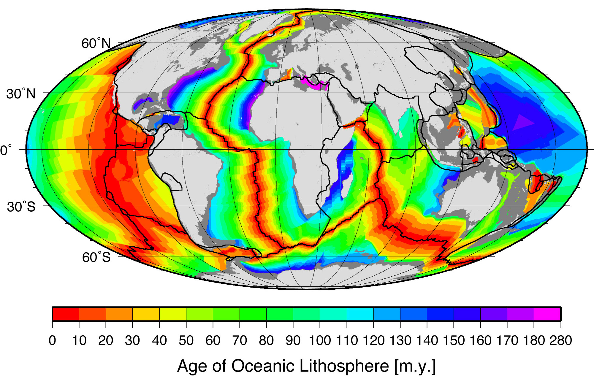
This doesn’t quite hold for continental crust, but for the sake of a simpler model, I made it so.
Combining the Metadata
At this point, we have two variables that can tell us whether a point is continental or not: the moho discontinuity, and the age of crust. Essentially, the older crust is, the more likely it is continental crust. The deeper the depth, the more likely it is continental crust. Thus, we can plot these on an axis from 0 to 1 (or 0 to 100, or -100 to 100, whatever you like), where 0 is the youngest crust or the shallowest moho depth, and 1 is the oldest crust and the deepest moho depth. Now, imagine for each point P, we store a 2D vector (a, m), where a is the age, and m is the moho depth for P. Essentially, if this point is (1, 1) it is absolutely continental, and if it is (0, 0), it is absolutely oceanic. In other words, we could simply look at the magnitude of each vector, and the points with the largest magnitudes are continental, and the lowest are oceanic.
Implementation
We can represent each property as an array of values from 0 to 1. I call these Planet Maps. In terms of its practical implementation, it’s just an array. Thus, the Lithosphere just holds each Planet Map.
Since each Planet Map uses a different algorithm for generation, we can create an object hierarchy to represent each generator. Thus our lithosphere generator just takes three map generators. The cool thing about this is that we can interchange different algorithms and experiment with them.
Now wait a minute, I mentioned that I have three generators to create planet maps, but we only need two of them? Actually, we do need three maps. This was the result of some experimentation. Essentially, we have our age map, and the moho distance map (which I call the thickness map), and then an extra detail map.
I will now cover in detail the different map generating systems.
Generating a Tectonics Map
Hang on, what is a tectonics map? Well, I used to have the age map. Essentially, it would store the distance from the boundary for every point in the plate. The closer to the plate boundary, the younger the crust. When I used this, I found the resulting maps had these strange circular seas form. This would be fine if you want like very alien worlds, but was unsuitable for my needs.
I thus decided the Age Map should be a general map to represent tectonic activity. In addition to age, it would contain data for collisions, plate density, and any thing else we want. Ultimately, I just picked a random value for every plate, and gave every point apart of that plate this value. Here’s an example output of this map with 20 plates.
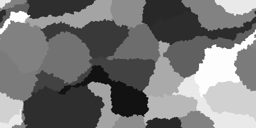
So you see, each point has the random value assigned to its plate. This would be great for just say a plate density map. However, I found this alone outputs very aesthetic worlds. One thing I’d be interested in exploring is generate a plate map with a series of sub maps. Also, the cool thing about the tectonic generator is that I can specify the number of plates. Here’s a world with 60 maps.
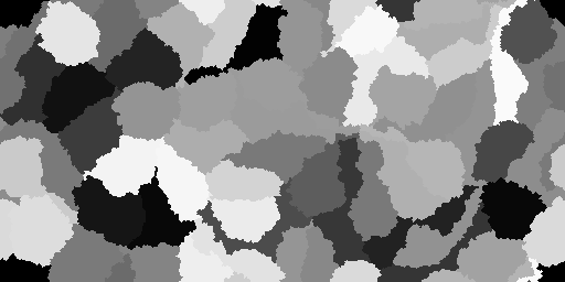
As a side note, the tectonic plates wrap around the edges of the map. That means, the edges are in fact adjacent to each other. If I step off the top edge of the map, I come out of the bottom, and vice-versa. The same principle applies to the left and right edges as well.
Generating a Crust Thickness and Detail Map
The next two maps used a simple Perlin noise generating algorithm. In fact, they used the one I mentioned above. So it’s not really Perlin noise, as the algorithm states. There really isn’t too much to say here about this. Here are some perlin noise maps to demonstrate what they look like:
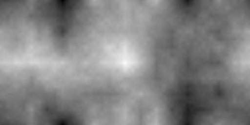
This one is not-perlin noise at 8 octaves and a persistence of 0.5f.
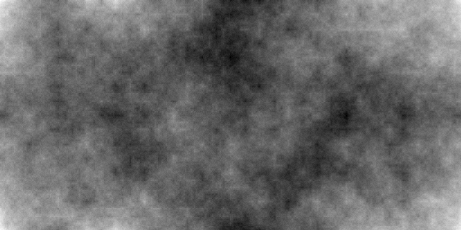
This one uses 8 octaves and a persistence of 0.75f. As you can see, it’s very easy to tune your parameters to get very interesting results.
Combinining the Maps
At this point, you have your three maps. Now comes the last and rather trivial part. The first step is for each point, take its thickness, tectonics activity, and detail data, treat these as components to a vector, and take the magnitude of this vector. Then, normalize each magnitude of every point such that it is a value from 0 to 1. Then sort these points. The first n points are ocean, the next m points are land, and the remaining points become mountainous. One thing to note, however, is that you need to make sure every point is clamped such that only ocean points have the ocean height range, the land points the land height range, and the mountains the mountain height range. This way, your height map will accurately reflect the types of crust they actually are.
I hope this gave some good insight into how Lithosphere generation was done. Feel free to download the code over on the Projects page and see all of this for yourself!